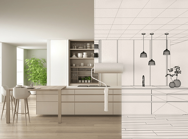
Introduction
Color is one of the most influential elements in interior design. It has the remarkable ability to transform a space, evoke emotions, and set the mood. Choosing the right color palette for your home is a crucial decision that can significantly impact the overall look and feel of your living spaces. In this blog post, we will explore the importance of color in interior design and offer valuable tips on how to select the perfect color scheme for your home.
The Psychology of Color
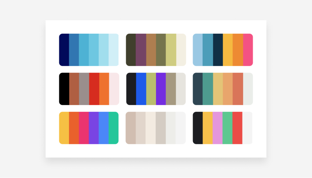
Before delving into the practical aspects of selecting a color palette, it’s essential to understand the psychology of color. Different colors can elicit various emotions and feelings. For example:
1. Blue: Blue is known for its calming and serene qualities, making it an excellent choice for bedrooms and bathrooms.
2. Red: This bold color is associated with energy and passion. It can be used as an accent color in areas where you want to create a dynamic atmosphere.
3. Green: Green symbolizes nature and tranquility. It’s ideal for spaces where you want to promote relaxation, such as living rooms or home offices.
4. Yellow: Yellow is cheerful and uplifting. It works well in kitchens and dining areas, where it can stimulate conversation and creativity.
5. Neutral Tones: Colors like beige, grey, and white are versatile and can serve as a backdrop for other bolder hues. They create a sense of simplicity and sophistication.
Choosing the Right Color Palette
Now that you have a basic understanding of color psychology, let’s explore how to choose the right color palette for your home:
1. Consider Your Personal Style: Start by reflecting on your personal style and preferences. Are you drawn to bold, vibrant colors, or do you prefer a more subdued and monochromatic look? Your home should reflect your personality.
2. Consider the Room’s Function: Think about the purpose of each room. For instance, a home office may benefit from calming blues and greens, while a dining room could incorporate warm and inviting tones like grey or off-white.
3. Harmonious Flow: To create a cohesive look throughout your home, select a color palette that flows from room to room. This doesn’t mean every room needs to be identical, but there should be a sense of harmony.
4. Test Samples: It’s crucial to test paint samples in your space before committing to a color. Paint a small section of the wall and observe how the color looks in different lighting conditions throughout the day.
5. Consider Lighting: Natural and artificial lighting can significantly affect how a color appears. Keep this in mind when making your final decision.
6. Texture and Materials: Think about the textures and materials in your space. Colors can look different when paired with different materials, such as wood, metal, or fabric.
Conclusion
In conclusion, the power of color in interior design cannot be underestimated. It has the ability to transform your home into a space that not only looks beautiful but also feels comfortable and suits your lifestyle. By considering your personal style, the psychology of color, and the function of each room, you can confidently choose the perfect color palette for your home. Remember, it’s all about creating an environment that makes you feel at ease and inspired every time you walk through the door.